If you're a SAS programmer, you have likely used loops in your SAS code to make life easier from time to time. In this blog post, I demonstrate a few ways you can use loops to do clever things in your graph code. Perhaps even the old dogs can learn some new tricks!
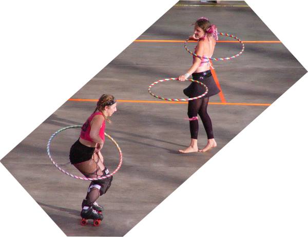
But before we get started ... speaking of loops (or hoops), here's a picture of some local hoopers (Julia with 2-hoops, and Holly with 1) performing during a Carolina Rollergirls roller derby bout intermission. Julia is a professional hooper and instructor, and does some amazing things with hoops. Hopefully I can teach you to do some amazing things with code loops, in my examples below! ;)
Creating a circle of a given radius on a map
You can easily annotate a circle on a map using the pie function, and you can also easily control the radius size of that circle ... but the units aren't really related to the physical distances represented on the map. If you want to create a circle with a radius reprecenting a certain number of miles, you'll need to calculate each point along the edge of the circle.
Here's the code loop I used in a data step to loop through 360 degrees, and calculate the x/y (longitude/latitude) points along the edge of a circle to annotate on a map (this is explained in detail in Example 9 of my book):
  do degree=0 to 360 by 5;

     /* Begin a new circle */
     if degree=0 then do;
        function='poly';
        style='empty';
        line=1;
        end;
     /* Continue drawing the circle */
     else do;
        /* Outline the circle with desired color */
        function='polycont';
        color="&inside_color";
        end;

     /* Calculate a point along the circle */
     y=arsin(cos(degree*d2r)*sin(&radius_miles/R)*cos(ycen*d2r)+cos(&radius_miles/R)*sin(ycen*d2r))/d2r;
     x=xcen+arsin(sin(degree*d2r)*sin(&radius_miles/R)/cos(y*d2r))/d2r;

     output;
  end;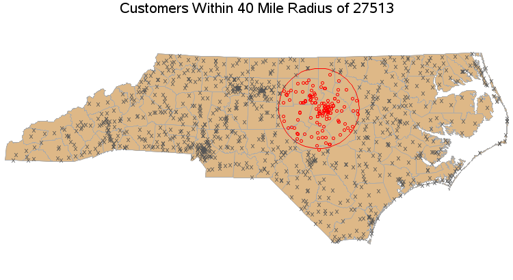
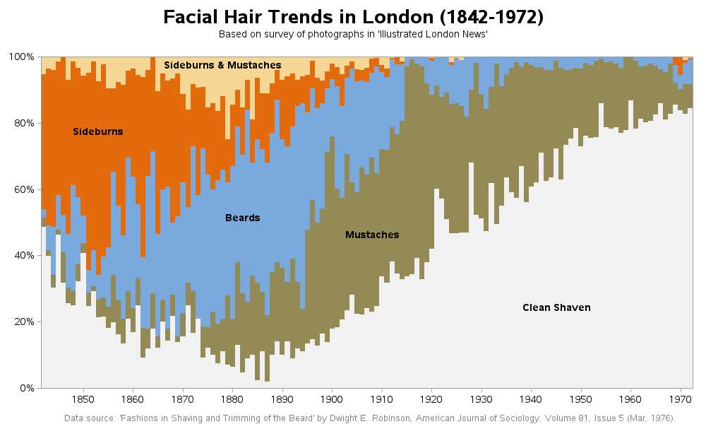
Looping through values to annotate custom axis
Sometimes it's difficult to get the items on an axis exactly the way you want them, using the built-in features in SAS. In those rare cases, you can suppress the default labels and use annotate to create custom text labels exactly like you want. And rather than hard-coding each text item, it's more convenient to use a loop!
Here's an example from my facial hair trends blog post. I used a bar chart to create this graph, and with bar charts SAS wants to label each bar with the year. There are over 100 bars, and that would have produced a very crowded axis - therefore I annotated just the years I wanted (by 10 year increments), using the following code:
data anno_years;
length function $8;
xsys='2'; ysys='1'; hsys='3'; when='a';
do year=1850 to 1970 by 10;
 midpoint=year;
 function='move'; y=0; output;
 function='draw'; color='grayaa'; size=.01; y=-1; output;
 function='label'; text=trim(left(year)); size=.; color=''; position='e'; output;
 end;
run;
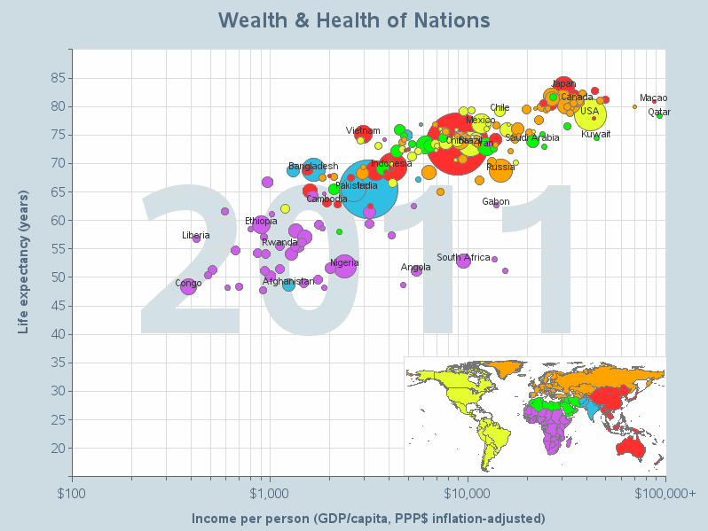
Looping through graphs to create an animation
In SAS, you can package multiple graphs together as a gif animation. You could create each graph of the animation one at a time, but it's a lot easier to use a by-statement (such as 'by year'). And this way you only have to maintain one copy of your code to create the graph!
I used this technique when I created my SAS version of Hans Rosling's famous animation in a recent blog post (click the image below to see the animated version). This one block of code creates all the individual graphs of the animation, using the 'by year' statement:
proc gplot data=gapminder_data uniform;
by year;
format life_expectancy comma5.0;
format income_pp_modified dollar8.0;
plot life_expectancy*income_pp_modified=1 /
 anno=anno_stuff
 vaxis=axis1 haxis=axis2
 autovref cvref=graydd
 chref=graydd
 href=(
  200 300 400 500 600 700 800 900 1000
  2000 3000 4000 5000 6000 7000 8000 9000 10000
  20000 30000 40000 50000 60000 70000 80000 90000 100000
  )
 noframe;
run;
Looping through items and calling a macro to draw graphs
With SAS procs, it's easy to add a 'by' line to create a graph for each by-group (as demonstrated above). But sometimes you might want to create multiple things for each by group (multiple graphs, or graphs and a table, etc) ... in which case you'll need to get a little trickier. One way to do this is to use a data step to loop through all the values, and call a macro to draw the graph(s), etc, each time through.
I used this trick in my recent blog post about beer. For each beer family, my data step calls a macro that generates an overall graph (showing all the beer styles in that family), and then creates a separate graph for each style.
data _null_; set families;
 call execute('%do_graphs('|| Style_family ||');');
run;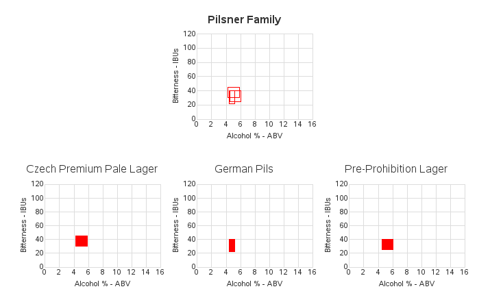
Hopefully these examples will show you how useful loops can be. Now it's your turn - feel free to share in a comment your favorite use for loops when creating graphs!


1 Comment
I can't wait to try these out! Once again thanks for the inspiration, especially the radius example.